KITSIGIANNIS ESTATE
Logo / branding / packaging design
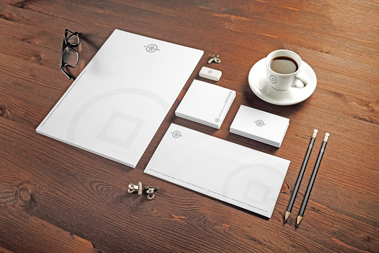
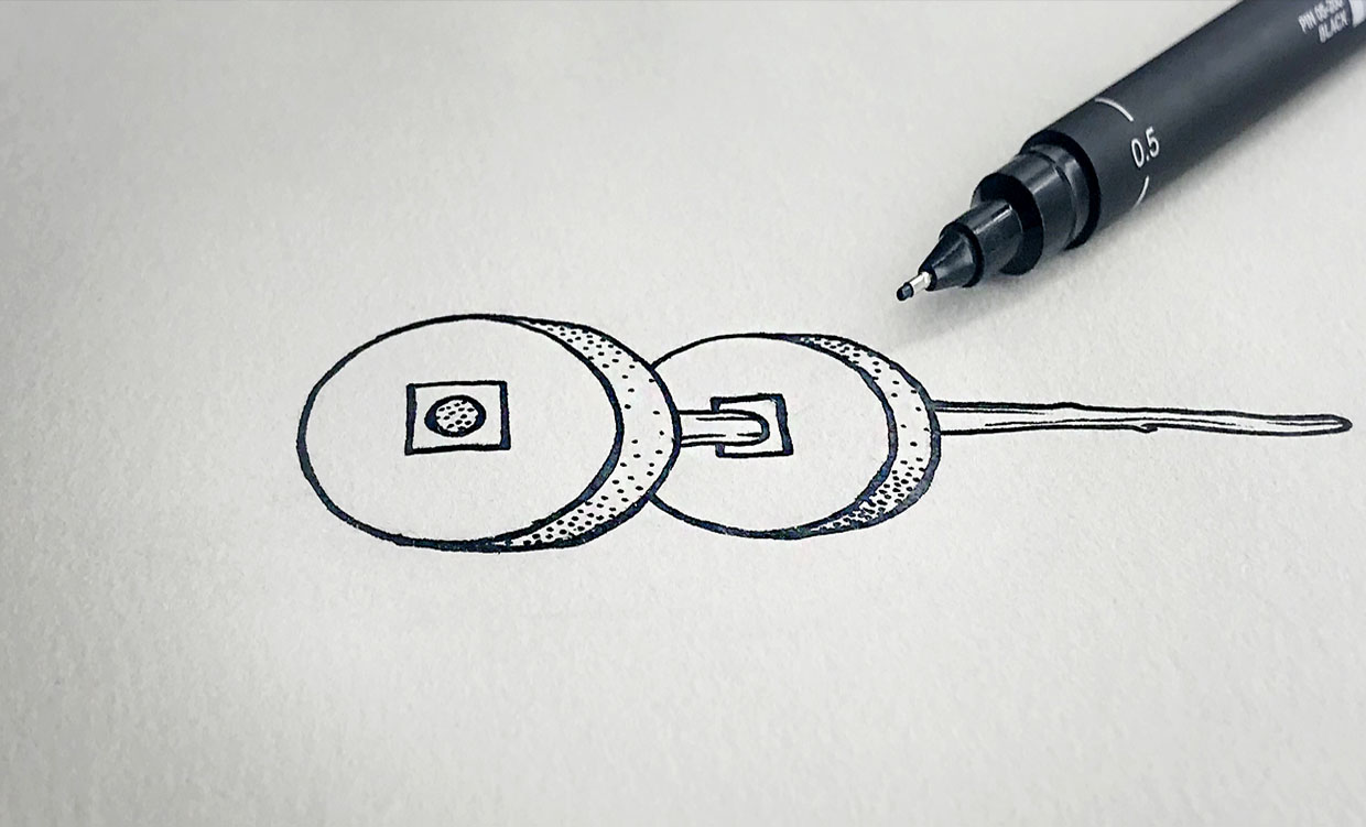
Our direct and relevant logo takes inspiration from the millstones which have resided at the olive mill since it was built, and it can be seen printed, in iconic simplicity, on various gift and office items, which continues to increase brand awareness.
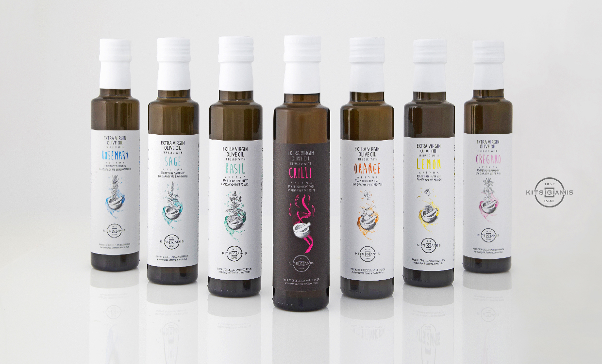
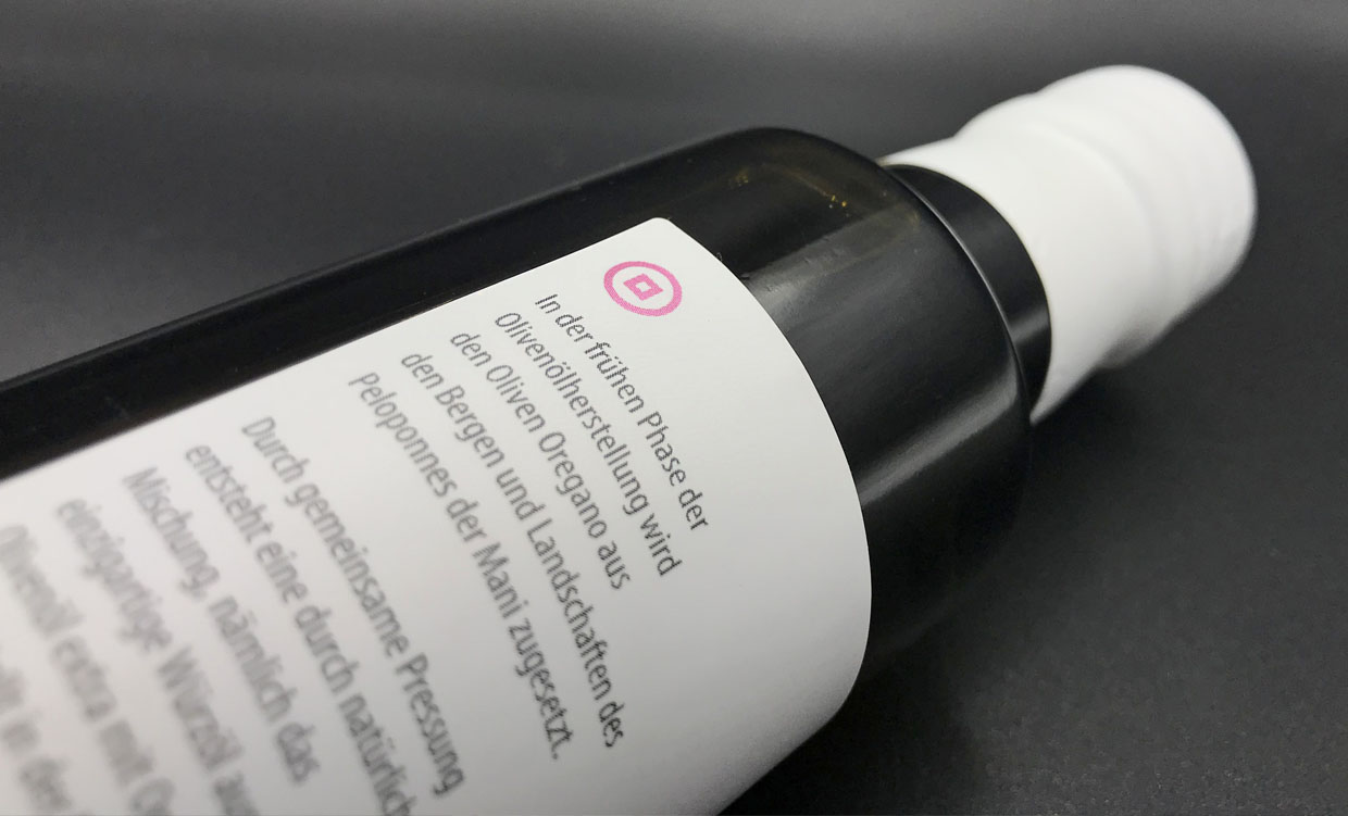
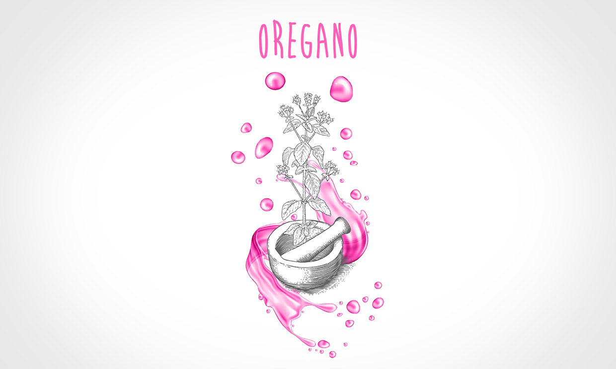
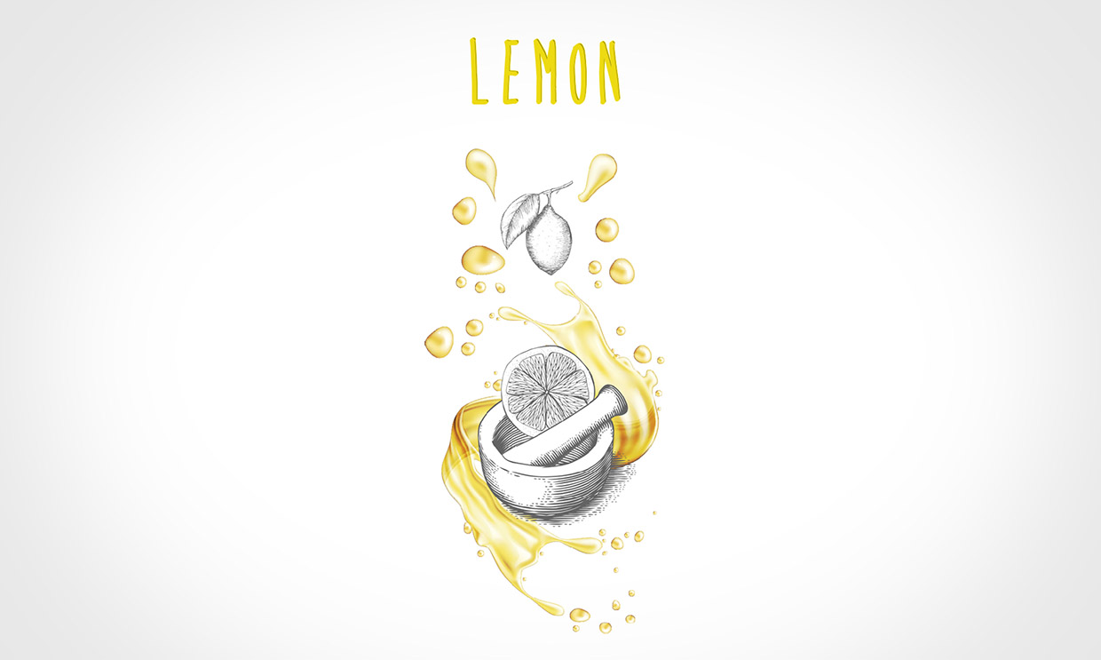
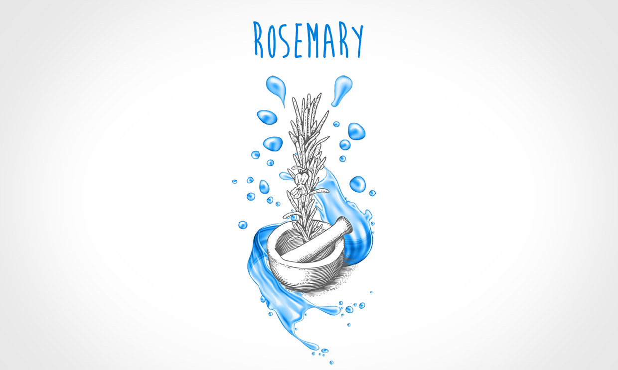
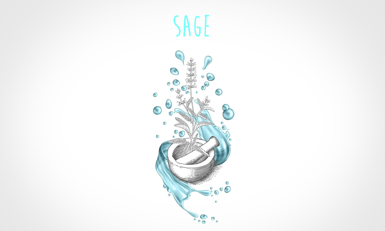
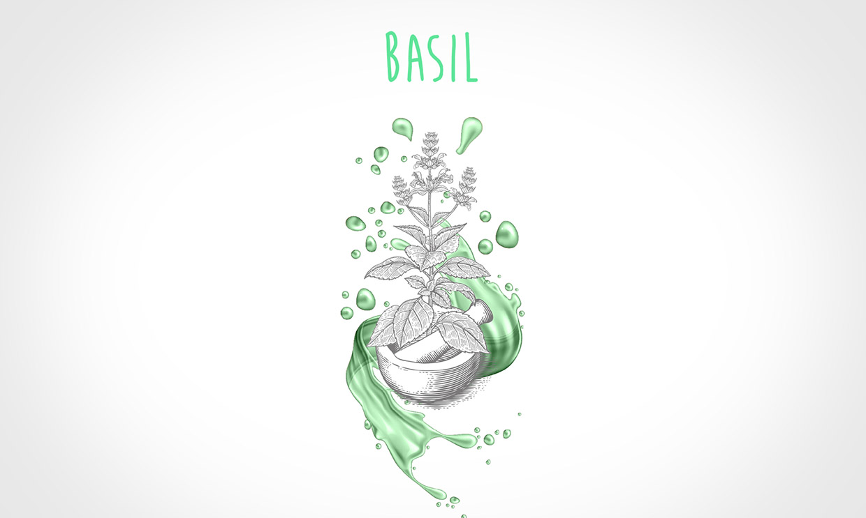
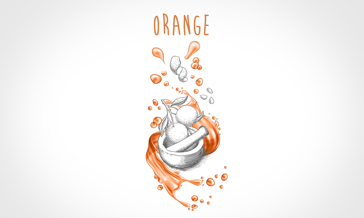
We chose our palette for the range very carefully and hope that each colour match resonates with the essence of the contents of the pestle and mortar and, of course, the bottle. When printed with metallic ink on a smooth, white or black label, the overall effect is striking.
The highest quality of olive oil, grown, harvested and processed on the family estate since 1857.
Blue Deer embarks on a project to rejuvenate the branding throughout the entire range of products. Designing both a succinct logo, which speaks of tradition and innovation, and packaging for an exciting range of naturally flavoured oils, enabling our client, Kitsigiannis Estate, to bring their locally renowned products to an international market.
We are excited to continue to support the company as they add to and refine their range of products, and forge their position in the marketplace.