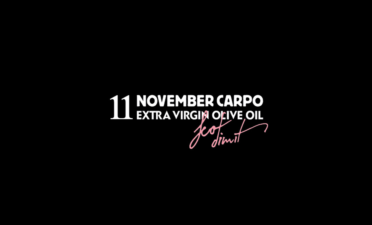
11 NOVEMBER CARPO OLIVE OIL
Logo / branding / packaging design / photography
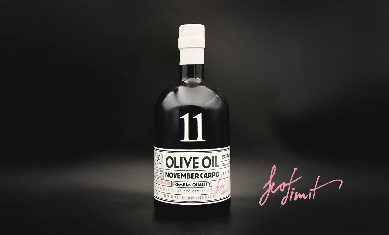
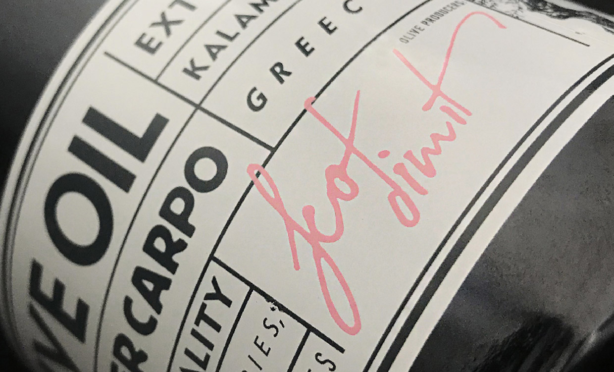
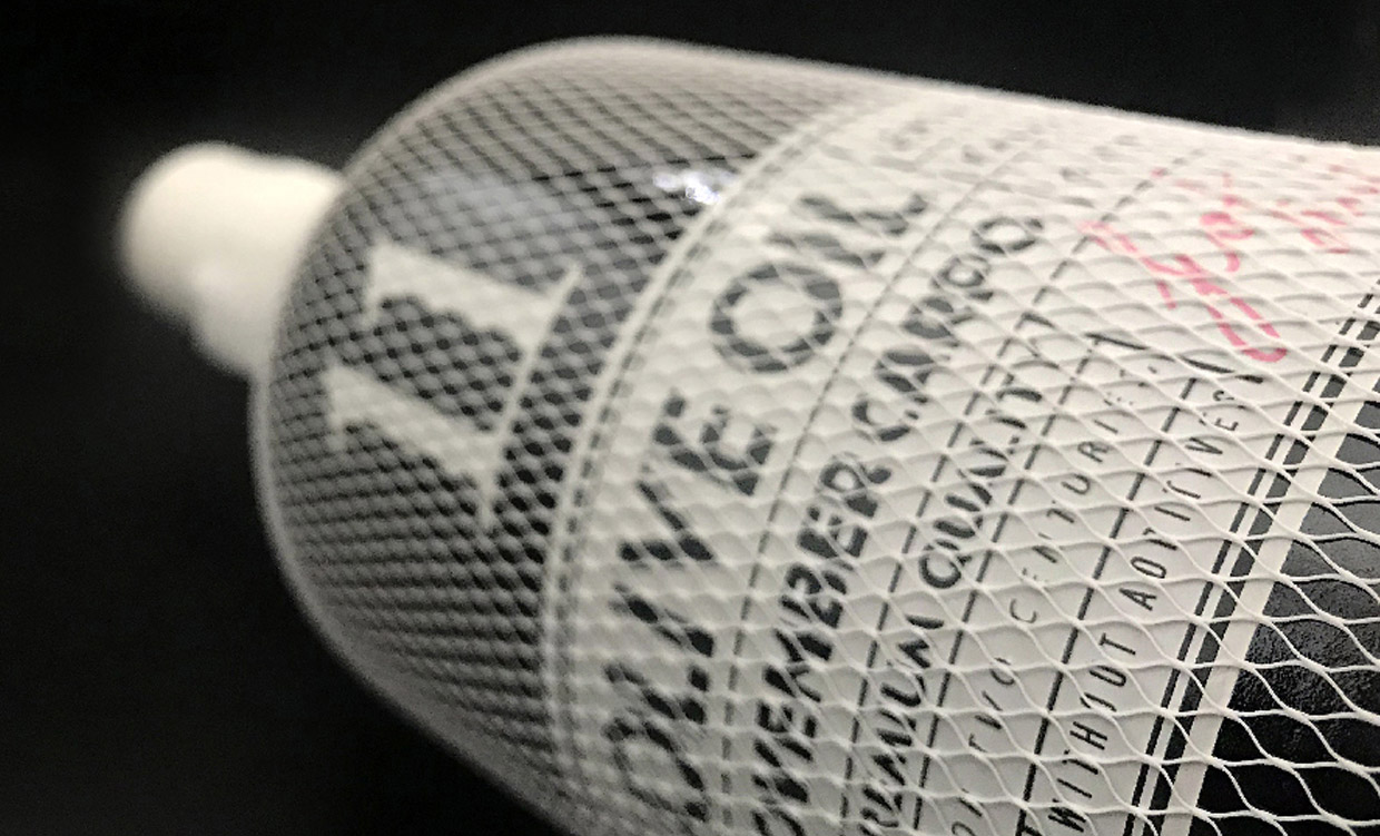
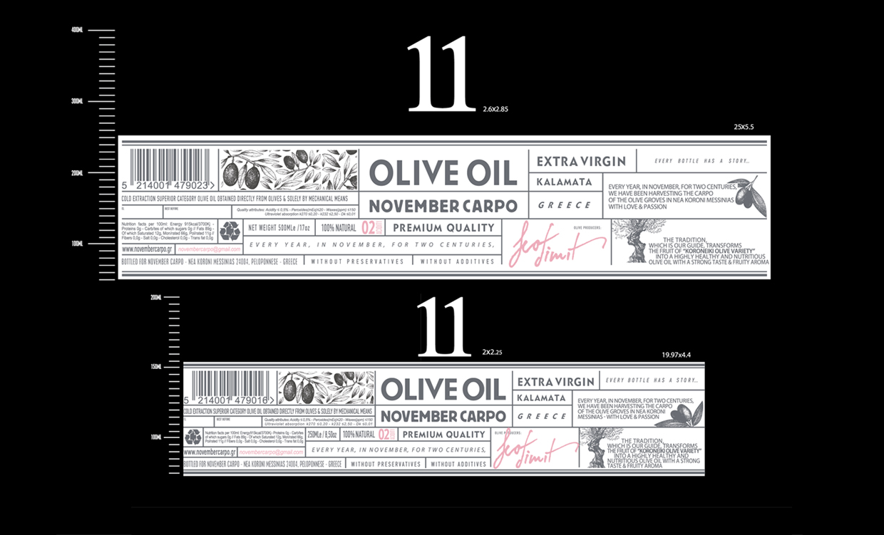
Because of the intended market and the absolute commitment to the quality of the contents of the bottle, Blue Deer opted for an interesting apothecary-type feel for the label which is combined with a bold, contemporary font for the logo.
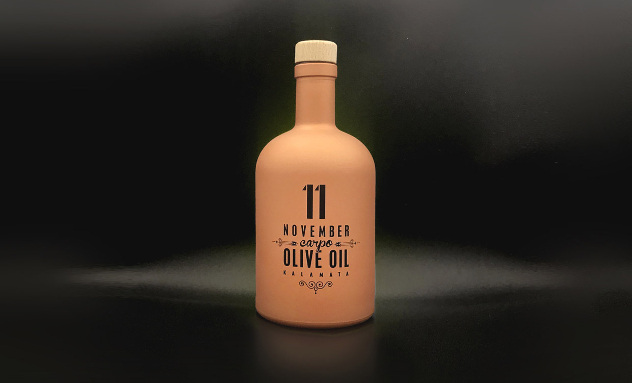
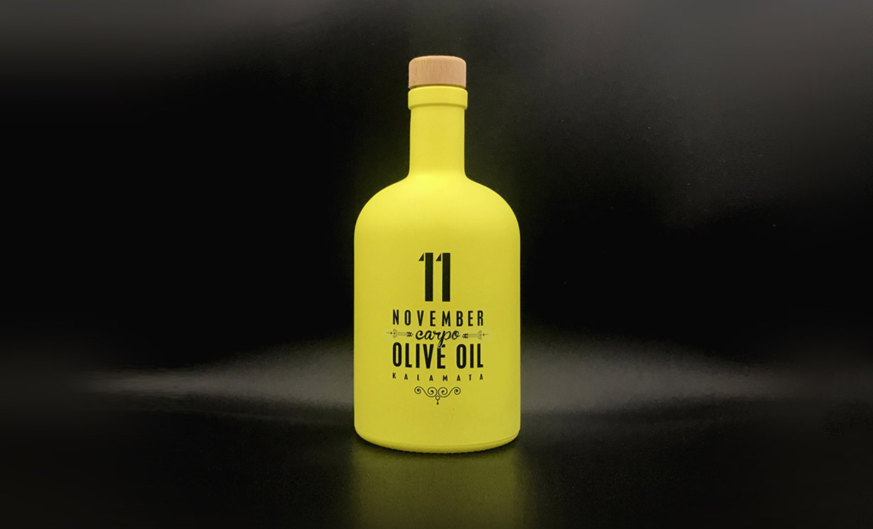
The pictures show our experimentation during the course of the project with different, new colouring techniques for bottles. Neon yellow and striking terra-cotta orange really make a statement and we will incorporate these techniques into future projects.
11 oil is a special product. Collected early in the season from organically grown trees from the Messinia region, it is a pharmaceutical grade oil, beneficial for health in many ways, which is sold primarily in Switzerland.
We at Blue Deer were delighted to be approached by a business so dedicated to ensuring the quality of their product, and to send another of our designs to the international market.