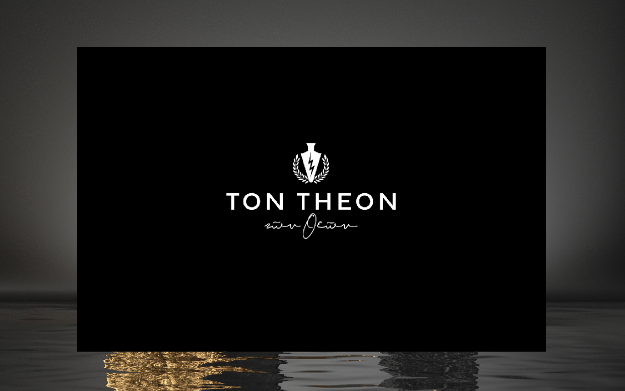
TON THEON
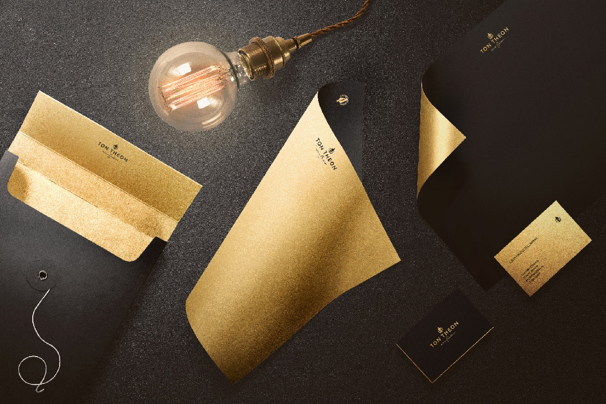
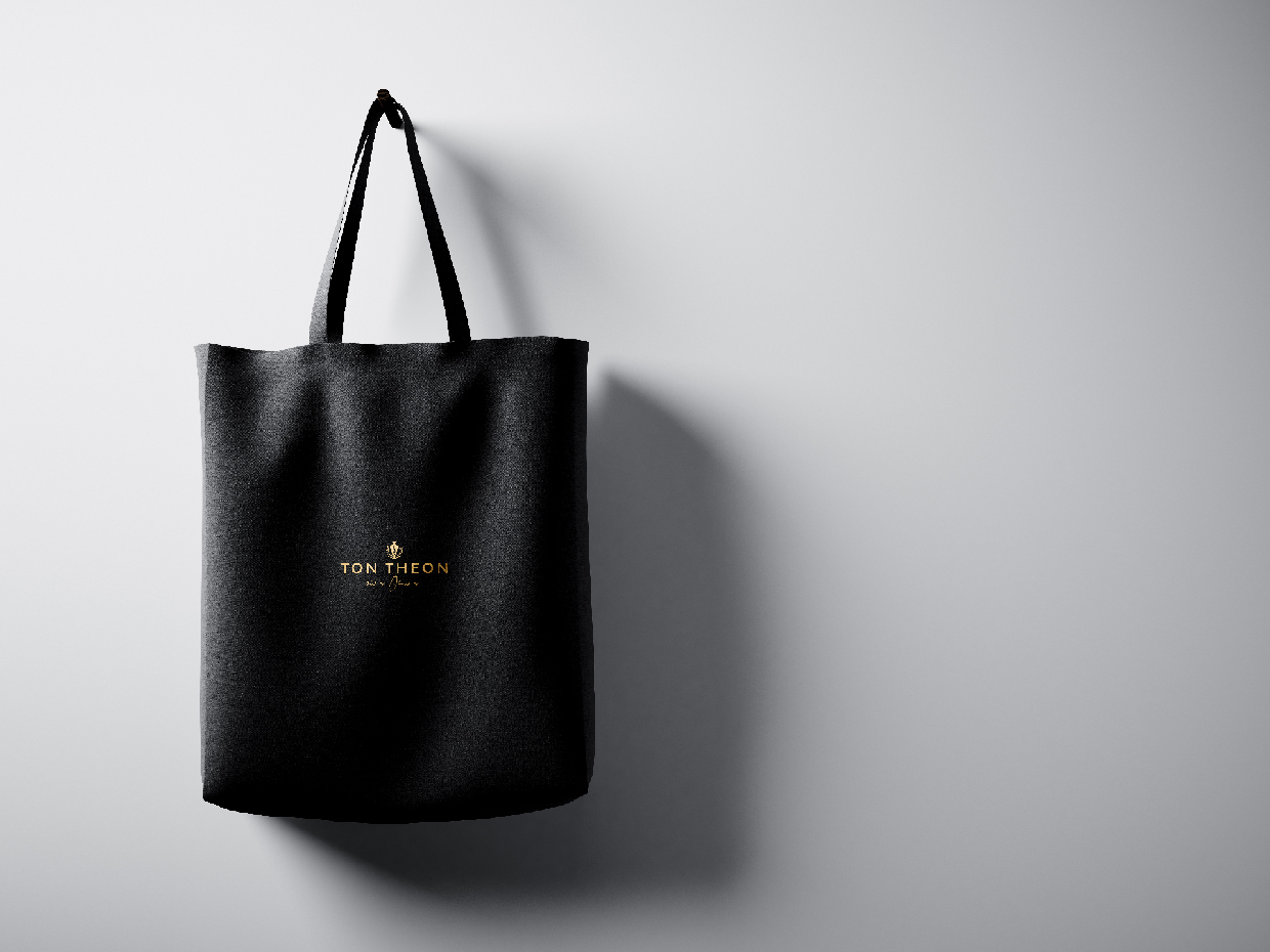
Logo / logotype / branding
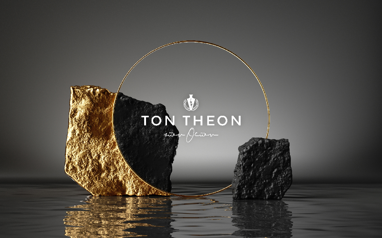
Hi Deer uses powerful symbols from Ancient Greece in the logo to give a sense of the drive and ambition of the company and the lightening strike from Zeus’ own hand speaks of decisive action, passion and heritage.
The concept artwork is all about quality, luxury and a sumptuous palette and the classical fonts that we used further connect the consumer with the history of the land.
Joep Pieter Van Berlo is a young entrepreneur with a base in the Netherlands and a deep connection with Greek culture and history. His first and second names, Joep Pieter (Jupiter) gave the inspiration for the name of the business, Ton Theon (of the Gods).
ΤΩΝ ΘΕΩΝ
Το διαχρονικά σύγχρονο παίρνει μορφή με δυναμική εικονογραφία από την αρχαία Ελλάδα και καθαρές γραμμές. Το πάθος και η αποφασιστικότητα του κεραυνού, ο πλούτος στο περιεχόμενο του αγγείου, η σαφήνεια στην επίτευξη των στόχων, διακρίνουν την επιχειρηματική δραστηριότητα του Joep Pieter Van Berlo· ολλανδική εταιρεία με ελληνικές αναφορές, επέλεξε ισχυρά σύμβολα και την Hi Deer για τον χτίσιμο της εταιρικής της ταυτότητας.